Typographic Map Process

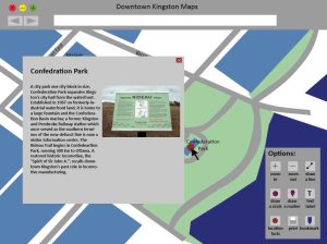
This was another assignment in the graphic design course but this time in Typography. The purpose of this project was to design a typographic map showing the typographic character of a local environment. I used photographs I  took of type in the field, such as signage, as well as did a written analysis of the typefaces, their classification and why I believe that type face was used. This was an assignment That I had a bit of a harder time with as I wasn’t quite sure what to do. But sometimes that’s the way an assignment goes, you’re just figuring it  out along the way on step at a time. So after doing some research and looking at examples of interactive maps online as well as choosing an area to depict, taking some photos of type in the area and deciding that the character of the typographic environment I wanted to try and get across was of a historic feel, the next thing I did was sketch out some thumbnails to try and figure out the layout of my map and then drew out a larger sketch of my idea for my layout.

Scan 8 Scan 9

I then did a mock-up of a style guide. The style guide was meant to help me figure out what colours I might use, and what type faces I might use.

Style Guide

Now that I had a rough idea of the layout, fonts and colour palette I did my first digital mock up in photoshop.

Typograhic Map 1 Welcome Typograhic Map 1 Main Typograhic Map 1 Pop Up

However I really misunderstood the assignment. I knew I needed three pages but rather than having a welcome page I just needed an introduction explaining the purpose of the map and assignment. I also included a bunch of different elements that I didn’t need such as the header and the options box, and the colour scheme just wasn’t working for the whole historic theme. So I redrew the map, got rid of the unnecessary elements and tried changing the colour palette to a sepia theme to tie into the historic feel as well as added the intro and fixed the pop up to what it’s supposed to be, showing a picture of the type and explaining it.

Typograhic Map 2 Intro Typograhic Map 2 Main Typograhic Map 2 Pop Up

Now the colours just weren’t working, they looked to close together and were bleeding together. It also wasn’t clear when you were rolling over a marker. So I changed the colours again, made the title look more decretive, and made the rollover state much more clear as well as putting on other final touches.

Typograhic Map Final Intro Typograhic Map Final Main Typograhic Map Final Pop Up

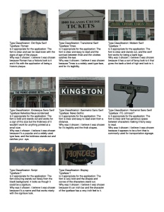
Now this final design only shows one of the pop-ups, we needed to include eight examples of type, which means the actual interactive map would have eight different pop-ups, so I put together a document showing those images with their information.

Type Classifications

and that was the process that I went through to create this typographic map. I hope this has given you some insight into my design process.

Logo Process

Notice: This was a school project. I am in no way associated with Henkaa, I was not hired by Henkaa, I do not work for Henkaa. This was entirely for the purpose of learning.

The objective of the project was to redesign a logo that will help to promote the assigned business, , and present the logo in 2 colours. The logo is also being presented on letterhead, an envelope, mailing label, and business card. The company  I was assigned is called Henkaa. They design, manufacture and sell women’s clothing specializing in making dresses that are convertible, meaning that they can change and be worn in a number of different ways. Their mission is to empower any women, of any size, in any situation to express their uniqueness through convertible fashion that changes.

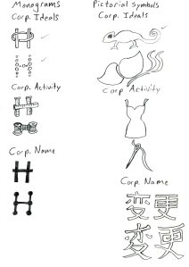
After researching Henkaa and figuring out what they do and what they value I started of by doing rough sketches. This first series of sketches focused on experimenting with word marks, emblems, monograms, pictorial symbols, and abstract symbols. As well as experimenting with the corporate name, corporate ideals and corporate activity.

Scan Scan 1 Scan 2

After group critiques with my classmates I narrowed down the best concepts. People seemed to be drawn to the chameleon, which I drew because chameleon’s are known for being able to change their colour, which ties into the company valuing change and creating dresses that can change styles. People were also drawn to the abstract drawing of the dress made up of curved lines. And I also wanted to work with a monogram some more. So the next step was to do some more sketches based on those three concepts. This time I focused on experimenting with fragmentation, outline, planar, imposing shoes or lines, containment, essence, and stylized. Scan 3 Scan 4 Scan 5 Scan 6

At this stage I also started experimenting with different type faces to figure out what would work best for the word mark.

Scan 7

After another critique with my classmates and teacher it was decided that the chameleon in the round, stylized style was the best way to go. I tried drawing the chameleon in illustrator using the pen tool and pairing it with the Henkaa word mark using the Lucida Calligraphy type face.

Henkaa Logo1

However  the shape of the chameleon was lost and after another critique the consensus was the type face wasn’t working. So I went back to the drawing board, redrew the chameleon using the pencil tool and tracing over the sketch and chose a new typeface, Candara.

Henkaa Logo2

I chose Candara as a type face because of the curvy lines that make up the characters and I felt that tied into the curvy shape of the chameleon. The type face was now working and I got the shape of the chameleon back from the sketch but it was still a little to rough looking. So I drew it again and rearranged the positioning of the chameleon.

Henkaa-Logo

After one final critique I knew the spiral shape of the tail was still a little off as I tried drawing it with the spiral tool in illustrator and it needed to be tweaked. This final time trying to draw the shape of the spiral with the polar grid tool.

Logo

After resolving the logo it was time to apply it to my stationary.

business card Envelope Mailing Label Sample Letter

And that is how I redesigned a corporate logo. I hope this has given you some insight into the design process.

Final Blog Post of the Semester: A Reflection on Blog Writing

My initial feelings of the blog assignment were apprehension. I realize that part of doing these blogs are to help us develop an online profile and give a personal perspective on these different graphic design related topics. Now maybe I’m an old fashioned kind of guy but I don’t really care for building an online profile. I’m someone who’s spent years developing my public speaking and communication skills. I prefer to communicate in person.
However I have learned a number of things. It’s helped me to learn about researching a topic, since with all of these different topics I would have to go read about them and find some images or links to social media to help support what I’m taking about. As well as posting links to this information to help support my opinions. Although it was sometimes a challenge to remember to cite everything.

If you want to know weather or not I intend to keep up with writing my blog outside of class assignments, I’d have to say I’m not sure. I’ve been writing this blog since last year and I’ve pretty much stuck to just writing for school assignments. And as I was talking about earlier I don’t care that much for writing a blog. But I may change my mind, there might end up being something I’m really interested in talking about that doesn’t have to do with a school assignment. Either way I’ve still got three semesters left in the graphic design program so I’m sure I’ll have to keep writing this blog for awhile yet.

Design Thinking

My problem: Making a custom made ring

The problem was I wanted a Green Lantern ring of my very own. Now you can get green lantern rings online but many of them are made out of plastic or other cheap materials and are not of very high quality. That’s why I wanted something a little nicer and needed one custom made. But I don’t know anything about making jewelry so what was I to do?

In comes Miranda Scott. Miranda and her friend Talia own their own business, Alchemy House Jewelry, where they make and sell their own jewelry as well as taking custom orders if someone wants something specific. They also teach classes if someone wants to learn how to make their own jewelry.

8573378

After I decided on the design I wanted, as there have been different variations on the green lantern ring over the years, I told Miranda what I was looking for and off she went to work. A few weeks later I had my ring.

4395429

DSC_1251

I sat down and did an interview with Miranda to find out a bit about her and her business and what goes into making these pieces of jewelry.

The Interview

What got you interested in making jewelry?

I started with beads, arts and crafts in high school. I did craft shows. The metal arts guild of Canada website helped me to discover schools. I went to York to study and I discovered silver smithing/ metalsmithing at George Brown College.

How do people approach you about making jewellery?

People email or come into the shop, my works been featured or I’ve posted on, buzz feed, when geeks wed and reddit.

When people approach you to have something made what kind of information do they give you?

They tell me their budget, which tells me what kind materials I can use. They tell me what kind of design they want. When I ask them questions I try to use terminology that people will understand like art nouveau or retro or modern.

Do you have to do further research?

Not so much research, but working independently to figure things out and refine details.

What kind of preparations do you do?

Sketching, wax mock-ups, colour renderings. I like to experiment try different things and see what works.

What does the process involve?

Setting the stones, polishing the metal. We use files, torches for saudering. As well as using drills, hammers and saws.

Do you ever have to make alterations?

Sometimes. I can fix the size, but I won’t change stones.

Are there any finishing touches you put on?

Polishing the jewelry, and putting the jewelry into Craft paper boxes for the customer.

Do you have anyone that inspires you?

Todd reed, Barbra Henrick, Michael David Sterling. I draw inspiration from these people. I like looking at stones they like to use and using those stones in own work.

I hope this gives you better idea of who Miranda is and what kind of work she does. As well as telling you a bit about the design process and how you can approach thinking about design. Both Miranda and Talia do awesome work. If your interested in buying some jewelry be sure to check out their website, you can find it here:

 http://www.alchemyhousejewellery.com

All images except for Green Lantern ring photo are from alchemy house jewellery’s website and used with permission. Green Lantern ring photo belongs to myself.

Design Thinkers

logo(6)

This past weekend the students of the Graphic Design program were meant to attend this years Design Thinkers Conference. Unfortunately we weren’t able to get enough students who wanted to go to get a bus. So only a handful of students who could make their own way there were able to attend and I sadly was not one of them. But as a graphic design student I’m a student member of RGD which means I can access member features of their website, such as videos of presentations from previous years Design Thinkers Conferences.

RGD Logo

One particular video I would like to talk about is a presentation by David Berman called How to make the entire planet your client. Now if your not a member of RGD you won’t be able to watch the video for yourself but you can check out his website here:

https://www.davidberman.com

check out his blog and take a look at his portfolio.

Now this is a fairly long video so I’m just going to talk about a few points that I found interesting. One thing he talks about is how designers can use design to save money. He gives this example of ecofonts, thick sans-serif fonts that have white in them, the purpose of which saves ink toner. Another example he gives are these trains in Germany called DB. They were designed in such a way that they are painted with a larger ratio of white to dark, which saved them a ton of money in paint, which paid for the entire design fee.

eco-font-1

Another interesting thing he talks about is the four stages of sustainability in design. It looks something like this.
1. Financial = Prosperity
2. Environmental = Planet
3. Social = People
4. Cultural = Design

David Berman happens to be the guy who helped establish these sustainability standards in design, first in Ontario and now spreading throughout the world.

He also talks about how traffic signals can be confusing for people who are colour blind since they can’t really see the difference between green and red. But in Quebec the traffic signals use both shapes and colours which makes them easier to understand if you can’t perceive colour.Here’s an example of a universal traffic light.

cbtrafficlight

David Berman is someone who is very passionate about using design to change the world. He’s got a lot of interesting things to say. Check out his website and find out what he can teach you.

RGD logo and Design thinkers logo are copyright Rgd and come from their website: http://www.rgd.ca

Ecofont image was found on: http://www.christianharries.com/eco-font/

Traffic light image was found on: http://www.yankodesign.com/2010/06/09/re-learning-the-traffic-lights/

Research

As a graphic designer, or a graphic design student in my case, when you take on a new client or new assignment you have to do your research. Now one of the assignments I’m currently working on is a brochure layout for a conference. There are several different categories and topics and my category is “Transportation Planning” and my specific topic is “Passing Lanes”. But this assignment is really all about accessibility and we have to keep that in mind when approaching design.

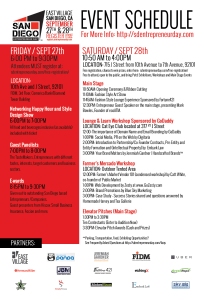
What kind of research have I done for this assignment? One of the first things I had to do was plan the layout of all the pieces of my brochure including text and graphics. So for research I looked up different examples of brochures to see different ways a brochure can be laid out. We also had to bring examples of schedules into class so we could all compare them and pick which ones we felt were the most effective. It’s important to pay attention to font size so it’s legible and the text is laid out in a manner that’s easy for people to read, especially if it’s someone that has some kind of disability since we’re keeping accessibility in mind.

SDE_CARD_BACK_4X6_FINAL Event-Schedule-TURKEY-2012-final

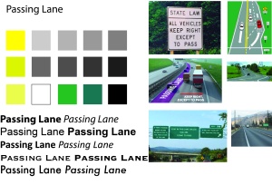
Given my topic of Passing Lanes I’ve also been looking at pictures of highways and passing lanes, as well as pictures of different kinds of signs that are used on streets and highways. One of the first things we did in class was put together mood boards. Mood boards help get a visual sense of what your piece could look like as it allows you to experiment with colours and fonts. Colours are important in helping to organize your information but again we have to keep accessibility in mind. Some people may be colour blind so you have to remember to keep good contrast so it’s easy for people with vision problems to read and to not strictly rely on colour. That’s why we use different font variations in our hierarchy.

Mood Board

When we hand in our final assignment we always have to include all of our process work, and later this year we will also be putting together process portfolios. And that’s why all this research is so important, it really helps you put together an assignment, you get marks for it and it will be important to the process portfolio later on. As well with all this talk of accessibility with new standards put in place it’s become something that’s important for designers and we’ll constantly have to keep it in mind when designing. What are some of your thoughts on accessibility? What kind of problems do you think you could run into and how would you approach design with all this in mind?

Why Does Typography Matter?

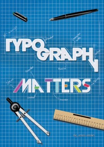
Typographymatters

Ever since beginning this Graphic Design course I’ve often thought why is Typography so important. What’s the big deal? It’s a major part of this course. There are typography classes every semester. There’s something like hundreds of thousands of different kinds of type. Why are there so many? As long as the type is legible why bother coming up with so many different variations? I mean most people probably don’t even recognize all of the subtle differences in different kinds of type. I know it’s something I never thought about before taking this course. I came to realize that I had to look at it from an artist and designers point of view. I found this article that really helped me try and think about typography in a different way.

http://www.commarts.com/columns/how-explain-typography

Well, the first thing to consider is many of these different kinds of type exist as logos and branding for all kinds of companies as many companies want a type that’s unique to them. The use of that special type can be as strong of an indicator for that brand as colour or imagery.

Another interesting thing this article talked about was comparing typography to fashion. We don’t really need all of these different styles so long as we have clothes that function, but people like to express themselves or look a certain way. Typography can be thought of in the same way.

Another interesting point this article made was the psychological effect. Just because people don’t notice the differences in all these different kinds of type doesn’t mean they aren’t reacting to it or being affected by it in different ways. Similar to how people can watch a movie and not notice things like the way the film was shot or edited yet can still be affected by these things.

There’s all kinds of other great articles out there about why typography is so important and there’s been different kinds of scientific research that’s gone into studying typography. I believe it’s something that people are going to become more aware of and start realizing some of these things. I hope this has helped you think more about why typography matters.

Typography Matters Image was found on

https://www.behance.net/gallery/14590029/Typography-Matters-Poster

It was created by Jessica Herodes

Whatever Happened to the Instruction Manual?

Today I’m talking about a kind of Information Design that has affected me in my life. I love to play Video games, and it’s always been that when you buy a new game, it comes with instructions to tell you how to play the game. Instruction Manuals sure have changed over the years. Allow me to elaborate.

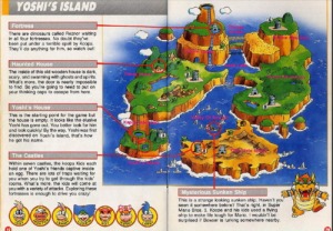
When I was a kid I had a Super Nintendo, I remember the instruction manuals for these games having a lot of pages, which were colourful and many of which had illustrations of the characters in the game. The illustrations helped show you how the controls worked and told you important information about things in the game, but they were also just fun to look at.

Mario world instructions

super mario instructions 2

super-mario-land-article

Then something started to happen with later game consoles. The instruction manuals were starting to change. Perhaps it was a cost cutting measure for some companies, but many of the manuals starting in the PS2 era were much shorter, only around ten pages, and in black and white with maybe a few screen shots and no illustrations. The only exception seemed to be Nintendo. Up until games on the Wii the instruction manuals were still quite thick and plenty colourful, but for many games instead of using illustrations they just used screen shots and character models from the game.

Instruction Manual 1

Instruction Manual 2

Now with the current games things have changed even more.When I buy a new game and open the box instead of finding an instruction manual, instead I find a fold out telling me how to access the electronic manual. I really don’t care for these electronic manuals for a number of reasons. If I want to access the manual I have to suspend or close my game. Gone are the colourful illustrations. The designs now are very uniform and rigid looking with almost no colour and few screen shots, it’s mostly just text. I also feel like with some games these manuals just don’t give enough information. For the last Animal Crossing game there was so much information I wanted to know, so I bought the official game guide, which is over 500 pages.

Instruction Manual 3

Instruction Manual 4

Instruction Manual 5

Unfortunately I feel like instruction manuals aren’t really fun to look at anymore. I feel like it’s more of a chore just to read them with the way their layed out and the fact that their on a screen. I wish they could bring back the kind of instruction manuals I had when I was a kid.

My Favourite three Typography Blogs

Today I’m taking a look at some Typography blogs I would like to share. As a Graphic Design student, Typography is a big part of the course and understanding how to design with type is such an important skill for a graphic designer to have.

The first blog I would like to share is called Typography Served:

www.typographyserved.com

First, I like the colours used in the design of this site. The black and yellow is really eye popping and grabs my attention. The site is laid out like a gallery, similar to something like Deviant Art. You can quickly see thumbnails for all of these designs people have shared. You can then click on a design to see a bigger version and read a post by the designers talking about the piece. Let me share one design I found on this site I really like.

Type design 1

I like that the design reminds me of a video game. They also put a bunch of pop cultural icons in this little city. See if you can spot Batman, Winnie the Pooh, Ryu from Street Fighter, Mario, Darth Vader, and Waldo of the Where’s Waldo books.
The second blog I would like to share is called Ministry of Type:

www.ministryoftype.co.uk/words/index/

What I like about this blog is there seems to be all kinds of cool design related things the writer will share especially things related to type, typography, lettering and calligraphy. The writer also tags his posts with different category’s such as advertising, type & typography, pictures found online, and lettering making the blog fairly easy to search to find things that may peak your interest. If I may share something cool I saw on this blog.

flying-cars

Look at the cars in the lower left picture. It looks like a lower case b. I like it because it reminded me of an assignment we did for photography last year where we had to go out and find letters among things like architecture.
The third blog I would like to share is The Font Feed:

fontfeed.com

The reason I like this blog is because they have posts talking about fonts they recommend, they also talk about type tips and have tutorials, which is great for anyone learning typography. And they also give all kinds of examples of fonts that are in use. For example the fonts used in the main title designs of certain tv shows as they talk about in this post:

http://fontfeed.com/archives/true-detective-wins-2014-emmy-award-for-outstanding-main-title-design/
Well, I hope these blogs get your creative juices flowing. Hopefully there’s something that catches your interest or there’s something that you find useful. Remember there’s a whole world of creative people out there and we can all inspire each other.

Citations:

Sale la primavera, salimos todos by Jose Alvarez Carratala and Alberto J. Saorin
http://www.typographyserved.com/gallery/Sale-la-primavera-salimos-todos/4037475

Flying Cars photos from http://www.judah.co.uk by Gerry Judah

Last Week of School

This will be my final post of the school year. I’m asking myself what you may be asking, how was the school year? Well, let me tell you, this ain’t my first rodeo. I’ve been through school once before.

The school year was very challenging from an academic standpoint. The work itself wasn’t always difficult, although some of the assignments really made me pull out my hair, it was difficult because this course has a very heavy workload. Most of my school year consisted of going to class and doing home work. Pretty boring, right? I did manage to find some club’s to join in my second semester and had some fun that way. However I was hoping that school would be a bit more fun.

Next year I intend to push myself harder and challenge myself. Not from an academic standpoint but from a personal standpoint. Next year I’m hoping I can have a more active social life and have some fun. And since I’ve been through school before and experienced more of the former than the latter that’s one of the reasons why I wanted to come back to school, and why I want things to be different next year. All work and no play makes for a dull life.